Article originally published here.
Landing pages are extremely important pieces of the marketing puzzle. A landing page is a one-page website that serves one purpose, and one purpose only, and that’s to get visitors to follow through on a single call to action.
This is your opportunity to create conversions and build your customer base.
Creating a successful landing page can be tough. Kyle L has pulled out some important principles that will help you create a successful landing page.
Landing page principles:
1. Keep it simple
Don’t overcomplicate it. The majority of visitors to your site will quickly scan through the page for the important information. Only when they see something that resonates with them, they’ll move to the next step of the journey.
2. Call To action
You must include a call to action (CTA) on your landing page. A landing page acts as a salesman in your absence. A good salesman would ask you to take action based on what they were showing you.
Your landing page should do the same. These present themselves in the way of a button or form that either allows the visitor to purchase or signup for a product or service.
3. Shout out the benefits
Visitors aren't enticed to buy products because of feature comparison charts. They buy a product that clearly communicates how it would benefit them personally or how it would benefit their business.
If you've fallen into the trap of listing your product's features, then try to shift the text to how those features would benefit the target customer instead. This is much more convincing.
Keep in mind pattern # 1 and remember that, if visitors see something they like, they will shift into "research" mode to learn more about that particular feature.
4. Value proposition
You should be able to convey your value proposition in 1 sentence as if you were delivering an elevator pitch. Could a random stranger figure out what your product offers without scrolling?
Here are some brilliant examples of five DevTool companies who follow the above principles.
1. Stream
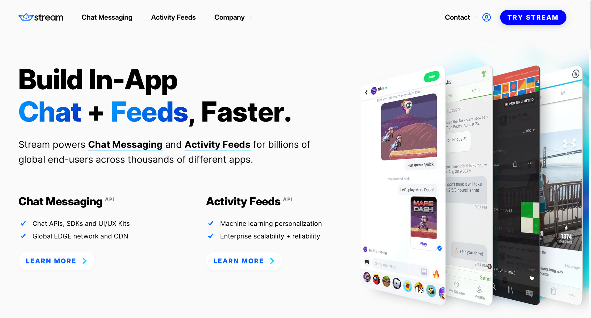
Stream enables scalable & fast API for building social networks, activity feeds, activity streams and chat apps. They have raised over $58.25M to build the best Chat Messaging & Activity Feed infrastructure available, with brilliant support.
Let's dig into their a look at their strapline:
Build In-App Chat + Feeds, Faster.
- "In-App" - instantly tells me it's for developers
- "Chat" - is super clear and compelling to me. Chat is so easily underestimated in complexity. I know how much of a pain it is.
- Feeds - makes me think of Facebook feed. I've never built a feed but I have a pretty good idea what this is going to involve.
- Faster - yes please! A great benefit. We love doing things faster.
The landing page copy is straight to the point, concise and easy to digest. Software developers can understand the benefits of using Stream in one scan of the landing page.
They also have a nice "Try Stream" CTA.
P.S. while having a beer with a former colleague, he told me his startup just subscribed to Stream and the purchasing experience was incredible. Definitely one to learn from!
2. Supabase
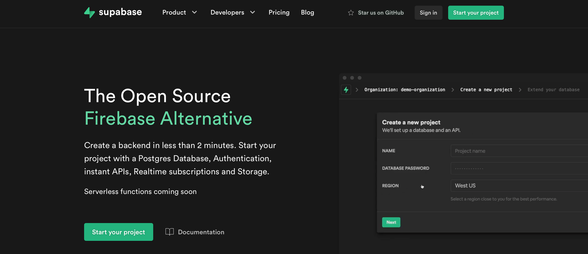
Supabase “The Open Source Firebase Alternative”, grabs your attention immediately. If you're a Firebase user, you instantly get it.
Your only question as a Firebase user is: "really?!"
The secondary copy answers this. “Create a backend in less than 2 minutes. Start your project with a Postgres Database, Authentication, instant APIs, Realtime subscriptions and Storage".
Supabase provide all the information a user needs to make the decision to move to the next stage.
As well as strong copy, Supabase have a great call to action. "Start your project" speaks directly to the user and is enticing them to begin their journey with Supabase.
3. Webflow
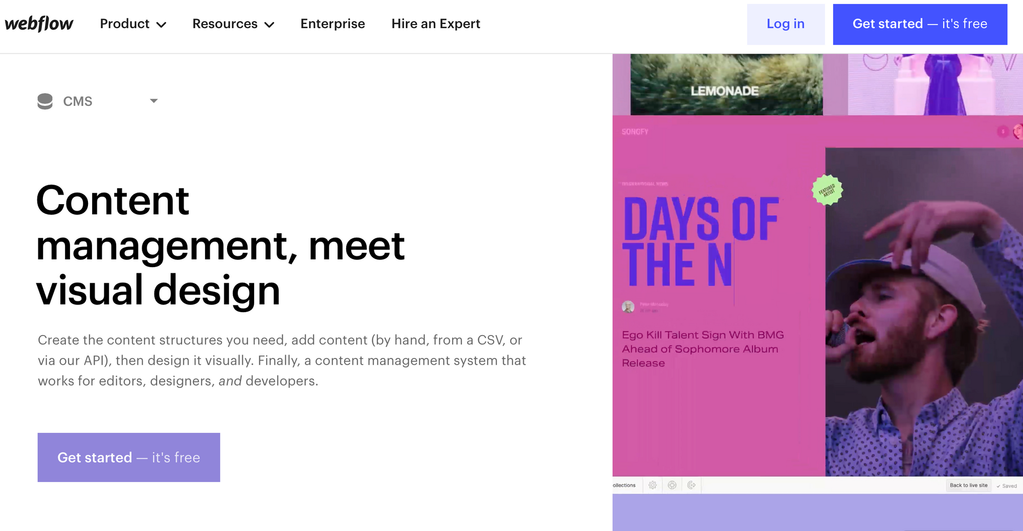
Webflow is the king of nocode. It's the kind of company Buzzfeed regularly tell us is making developers redundant. Well, I use it and it feels like a DevTool to me.
Content management, meet visual design
From looking at their CMS landing page, you can understand straight away the service that they provide and how you get a hold of that service. The simple headline and page hierarchy catches your attention even more.
The great thing about Webflow is that they have specific landing pages for their specific audiences. They’ve realised that they can’t cater to everyone in one page. Take a look at the different approaches, designer, ecommerce, interactions.
If I had to make one suggestion, maybe a dedicated "Developers" page would be nice. They could directly address some of the fears we have when going nocode:
- Lock-in
- Lack of customisation
- Clunky custom code experience
4. Courier
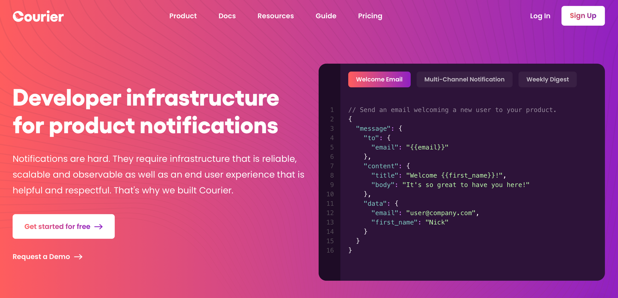
Courier's mission is to "make software to human communication delightful".
They specifically call out developers - a great strategy. Product notifications is also super specific, so it's quite clear.
The secondary copy is appealing to the user and is extremely relatable. Courier aren’t overcomplicating the problem or their solution.
Courier are presenting two separate CTAs to their audience, and both are attractive to the user. You can begin your Courier journey for free or (targeted at Enterprise) you can receive support from the team - both positive routes to go down.
5. Doppler
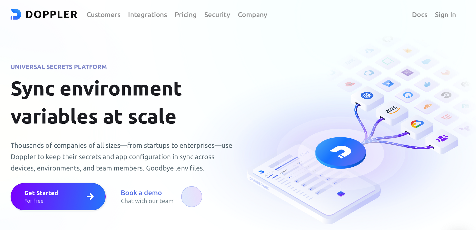
"Sync environment variable at scale"
I can't tell you how many times I've found I'm missing an env variable for a new integration. I go to Slack and the developer who built the features sends it to me.
An undeniably terrible practice but I'm sure we aren't alone.
Developers instantly know the value of what Doppler do and the pain they're solving.
The value propositions that Doppler have included on their landing page explain who uses Doppler, why they use Doppler and the benefits of using Doppler.
Developers can relate to this immediately. Doppler is another company who present two CTAs on their landing page. "For free" and "Book a demo".
Lesson - try having a separate CTA for enterprise and SME customers.
6. Retool
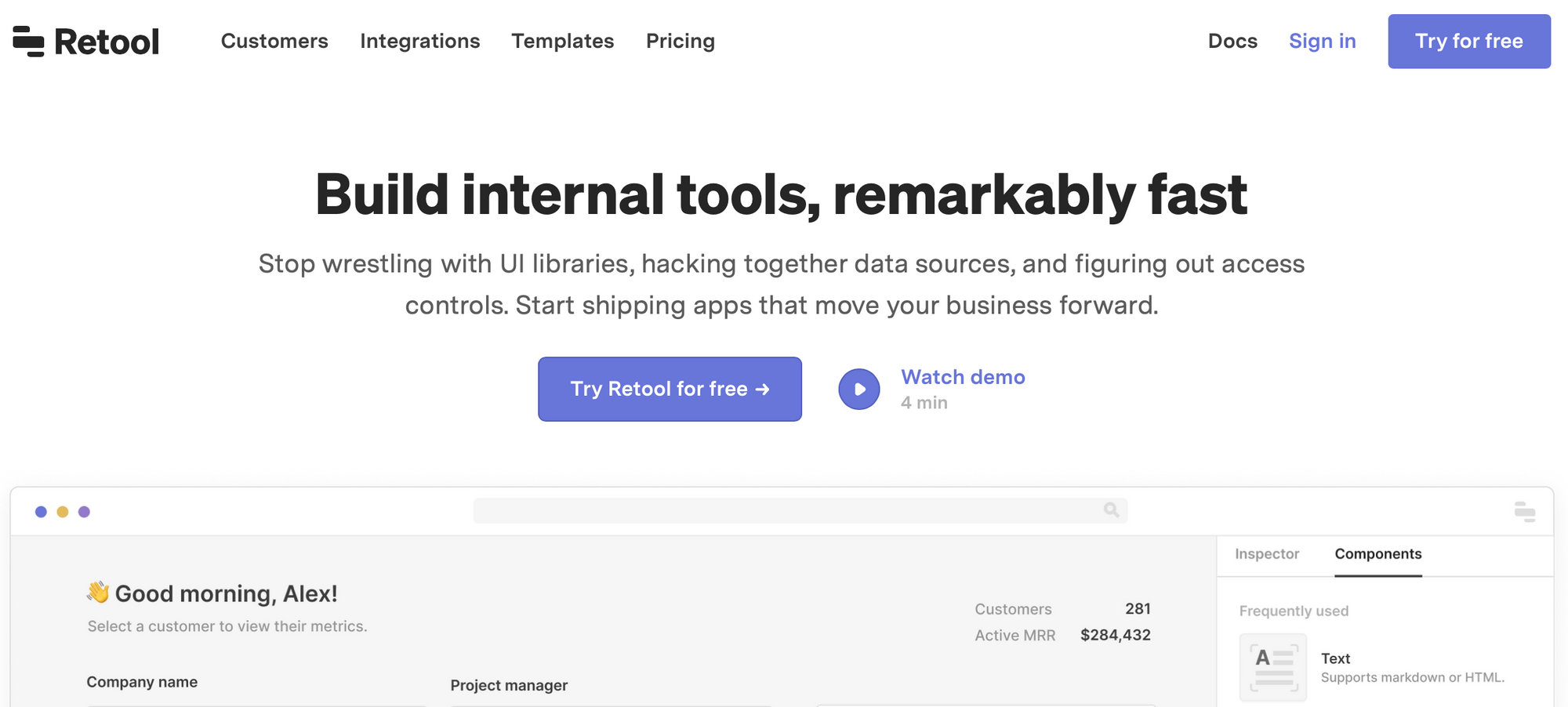
Retool build tools for companies to develop better software faster. "Build internal tools, remarkably fast". If you've ever built an internal tool, your ears will prick up.
Then they drop the bomb:
"Stop wrestling with UI libraries, hacking together data sources, and figuring out access controls. Start shipping apps that move your business forward."
I've been in teams that spend weeks, months and years building internal tools using the same development practices we use for user-facing tools. After reading this, I'm almost in tears. Yes, I relate! I relate to this so much.
I use Retool for one of my clients and, instead of spending weeks building a sh***y table, I built a fully interactive detailed dashboard with exports, sorting, filtering in a day or two.
Retool shouts about the benefits of the product (speed), the problems they're solving, and clearly offers a solution.
By relaying the problems that people are facing, people relate and already feel a connection with the product.
Become a member of the Developer Marketing Alliance and get access to exclusive content, templates and frameworks, and so much more.
