Your software is improving all the time… You’re battling your competition, moving fast, and listening to your users when they tell you what they need.
For a small set of loyal customers, your latest feature was the answer to their product prayers (“finally!” they collectively exclaim).
For the rest of your customers — who are still learning your product’s existing functionality — that new feature doesn’t even exist.
A feature without an effective announcement and user onboarding strategy isn’t a feature at all. It’s wasted dev time and a layer of complexity for your users.
“Nobody cares about the thing you’ve designed, unless you can get them past the beginning.” — Julie Zhou, Product Design VP @ Facebook
Developing new features is only half the battle. What comes next can make or break adoption. Whenever you improve your product, you’ve got to nail the feature announcement and user onboarding.
That means communicating relevant value with context — at the right time, with the right messaging.
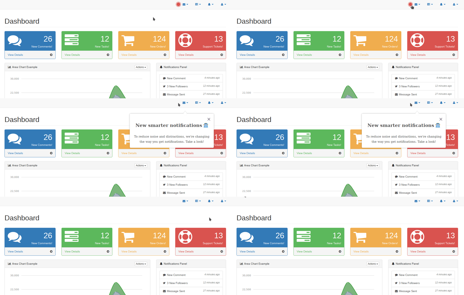
👉 In this post, we reveal the psychology behind feature adoption, share a feature announcement framework, and cover best practices to help you successfully launch your feature or product.
Why feature announcements matter
A feature is a finely-crafted work of code. You’ve tested every component, briefed the CS team, and even edited the email and blog post. It’s finally over and done with… but it’s not!
You need to be sure your feature is getting traction. It won’t help engage existing customers or convert new ones if users don’t change their habits and start using it. To enable this, you need a strategy.
The benefits of a good feature announcement product marketing strategy are huge:
- Reduce churn by re-engaging users that are evaluating competitors or unsatisfied with existing limitations
- Improve loyalty by proving to your existing users that you are listening to their needs and moving quickly
- Boost retention by getting users hooked on a feature that helps them become more successful
However, your users don’t always see it that way…
Your users are resistant to change 😱
The forces of psychology work against you when you build new features. Unless a user is aware of the pain your feature addresses, they’d rather avoid using it in case something goes wrong.
Did you know that only 21% of iOS users install app updates within a week of release?
That’s because the users see no value in updating. It requires tapping, waiting, and the risk that something could turn out worse than it is. These users could be happy enough, but they aren’t wowed or engaged by new features. In fact, they might even be scared.
Research from all throughout history shows that fear of change is hardcoded into our DNA. It’s what helped us survive in the era where getting eaten by a lynx or poisoned by a strange berry was an everyday thing.
We have that same mentality today — despite being far, far safer. Your users aren’t nervously keeping watch for strange sights by a dim campfire, but they do have the same fear responses.
Gradually introducing a new feature with the right timing and messaging can help build familiarity and drive adoption.
Our feature announcement framework
Here’s a simple framework that all product marketers should use to plan your upcoming feature announcement strategy:
- Goal
- User
- Priority
- Channels
This is how it looks alongside a traditional product roadmap using Airtable’s template:

Why bother planning? Well, for SaaS companies, new features are closely linked to the product and marketing strategy. A new feature enables new use cases, blog posts, keywords, and help docs. It’s like a mini product release, and you wouldn’t leave that up to chance.
When a feature is first rolled out, you need a laser-focused strategy for getting it discovered, adopted, and lovingly tweeted about by your users.
For this, look at your product roadmap and think about these four data points for each upcoming feature:
1. The goal

Defining a goal will help you get alignment across the team. It sets an anchor point to measure the success of your feature launch, and ensures you make decisions that have a clear focus.
What KPI are you trying to improve with this feature?
For example, the goal for a new feature that lets Pro users control access permissions could be: “To convert more freemium users that work in teams.”
2. The target user
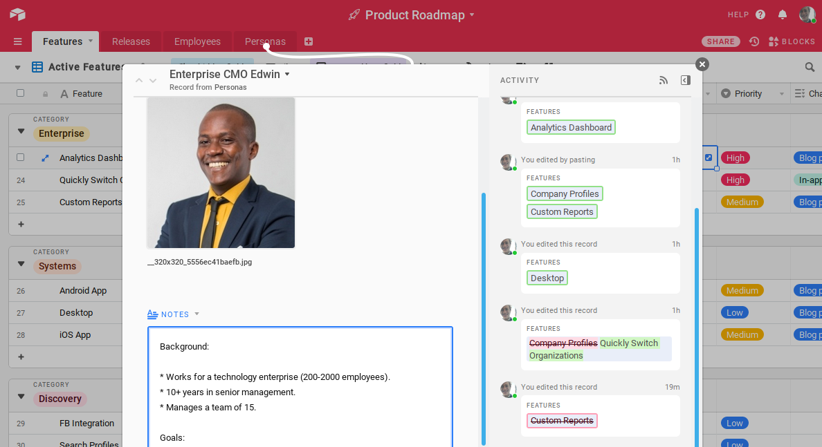
Not all users are created equal, and certain features will resonate with some personas and not others. Even if a new feature announcement would broadly benefit your entire user base, there will likely be a segment that cares more than the average user. Maintain a high signal-to-noise ratio by focusing your announcement on these best-fit users.
Who will become successful thanks to this feature?
For example, your target user for the feature could be department heads who want to track how their teams are performing. This helps you nail your messaging and know how best to segment the announcement. Personas will be useful here.
3. Feature priority
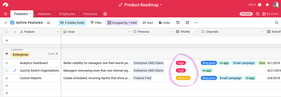
To avoid desensitizing your users to your content or messaging, you have to maintain a high signal-to-noise ratio. To enable this, you must decide which features get more airtime than others. Do this by evaluating the business value each feature/ improvement can potentially drive, and how important this is to your company’s overall goals.
How vital is it that we make this feature stick?
For example, include a field for prioritization (low — high) which corresponds to the channels used. A high priority item may be a new product launch that requires promotion in all channels, whereas for a low priority item a single channel may suffice.
4. Target channels

You know who you’re targeting, what you’re looking to impact, and when you’re going to do the launch.
All that’s left is where (we’ll examine the how next).
Here are the most common channels for feature announcements to consider:
- In-product UX
- Blog posts
- Emails
- In-product messaging
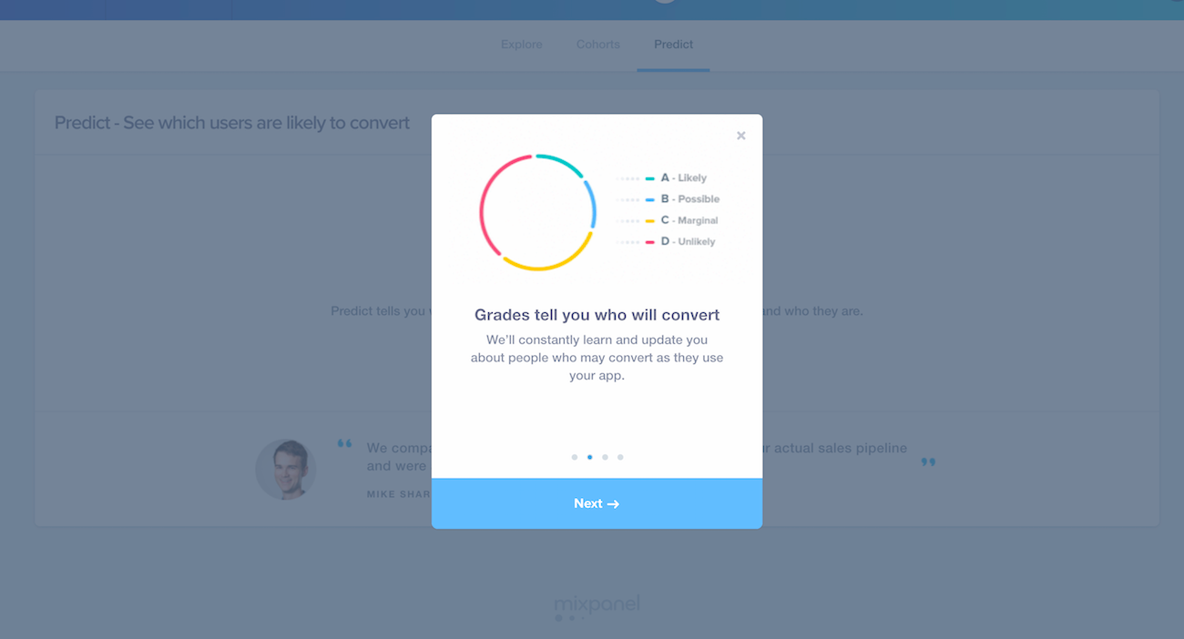
In-product UX: Changes to UX, such as a modal, or product tour, help highlight new features and coach users be successful. You can guide your users directly to the new feature and show segmented messaging to help them get adopted. Our users have seen 50% higher adoption rates on new features thanks to product tours.
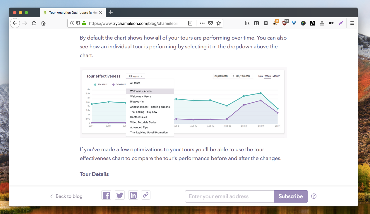
Blog posts: Release notes, case studies, and use case demonstrations give you a permanent resource to show users. It also gives sales, support, and customer success better resources to share with leads and customers.

Email: Craft one-off announcements and continuous drip campaigns that help reactivate churning users who aren’t engaging in-app.

In-product messaging: Deliver segmented, timely feature announcements that convert better than email and reduce friction because they’re in the context of the app.
Feature announcement types
Let’s take a deep dive into each announcement channel and the best practices behind the scenes.
Product UX
When to use: to visually highlight the feature inside your product and drive direct action in the moment.
EXAMPLE #1: Google Analytics

This feature announcement from Google Analytics is delivered as a tooltip which explains the scope of the feature and provides a call to action.
Since this announcement is in-app, users don’t have to translate a help doc’s instructions or screenshots into their experience; they can click “see report” to dive right in and see value instantly. In-app feature announcements can give vital context to the instructions and information you send your users, and enable immediate action.
EXAMPLE #2: Facebook
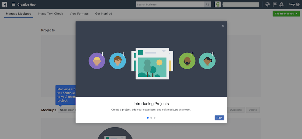
This new feature announcement was delivered to users of Facebook’s Creative Hub to announce the addition of team collaboration features. It uses short copy, clear visuals, and contextual tooltips as fallbacks to catch users with different attention spans.
The bold modal is used as plan A — it includes a one-liner that sums up the scope of the feature even if users don’t click next. For a glancing user, the standard avatar-with-a-plus-sign is used as an “Add your team” signal. If the user decides to close the modal, they still get plan B: the tooltips underneath describe new functionality and changes users can expect.
- Optimize the first line of the announcement with essential information to reach users that skim or only see the preview text.
- Tailor which use cases you highlight to which user segment, as to better communicate relevant value. For example, tell organization admins about a way your feature helps them manage the team.
- Send a sequence of messages to build awareness about the feature before calling users to action. An example of a series might be three messages: #1 to make the user motivated to try the feature, #2 to explain how it works, and #3 to drive action now.
- Set a trigger for the announcement so it shows at the time and place it’ll get the best results. For example, when the user clicks on the new feature for the first time, or when the user starts a new session.
- Elaborate with links to relevant help docs and blog posts.
- Embed videos, gifs, and other helpful visuals to make the announcement eye-catching and information-rich.
Good in-app feature announcements for inspiration:
Blog posts
When to use: to create a permanent asset that can be shared with existing customers, and a way to gain new customers by linking your feature’s use cases to their pain points.
EXAMPLE #1: Twilio
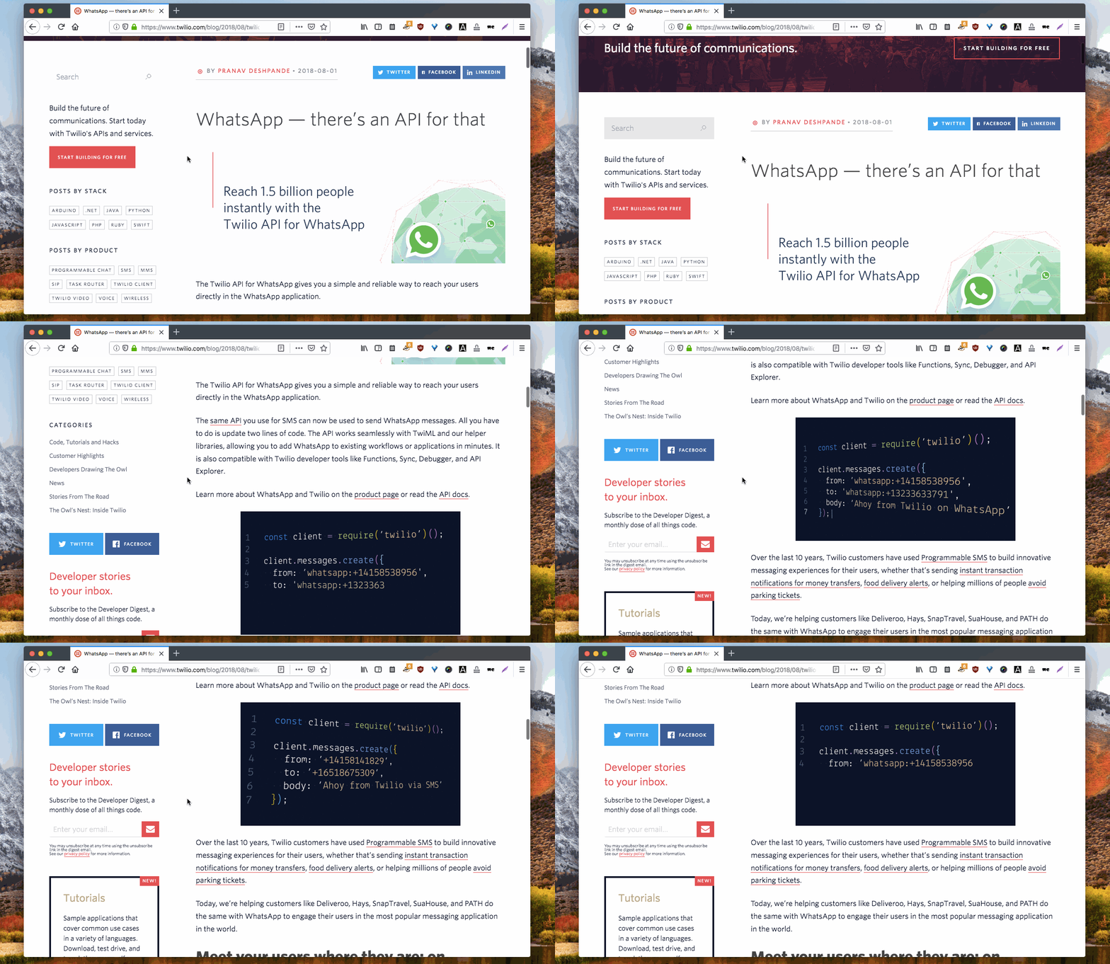
This feature announcement post from Twilio is written to tell customers about the new WhatsApp API, and to address any objections that they might hear from their developers:“The Twilio API for WhatsApp gives you a simple and reliable way to reach your users directly in the WhatsApp application.
The same API you use for SMS can now be used to send WhatsApp messages. All you have to do is update two lines of code. “The post includes a code snippet that quickly demonstrates how easy it is to incorporate WhatsApp functionality into your existing Twilio apps. It also links off to help documentation, a getting started guide, and examples of existing Twilio apps using the WhatsApp API.
EXAMPLE #2: Asana
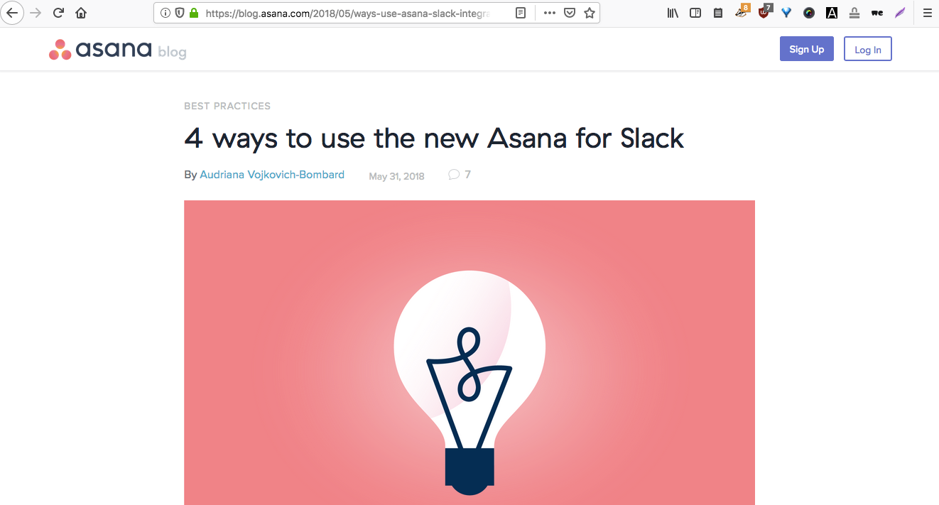
Going further than a simple announcement, the long-form nature of your blog makes it possible to cover multiple inspiring use cases for a new feature to teach your users best practices and let them pictures themselves applying the feature to their own workflows.
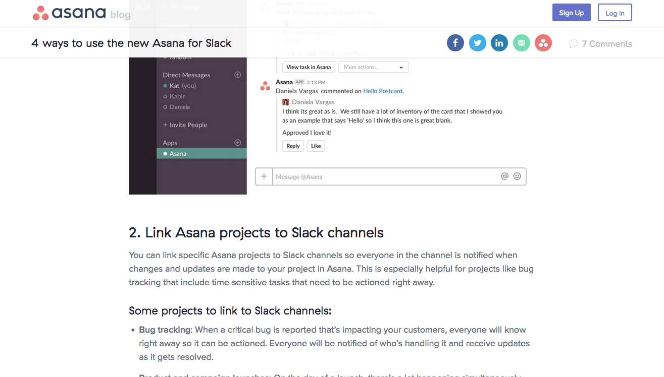
Asana’s Slack app made it possible for Slack users to manage Asana tasks without leaving their work chat. But if you’re used to using Asana and Slack anyway, what’s the specific value? The Asana Slack app blog post was written to answer that question.
Blog post feature announcement best practices
- Use plenty of screenshots that show off real use cases with realistic data (not “Test” and “123”)
- Briefly explain the feature before connecting that to the way it can help your customers. Link components to tangible benefits, for example how a new activity feed makes it possible to see events from multiple places without switching screens.
- Write multiple posts: one for use cases, one for the overview, one mention in the release notes
- Include all of the functional details, and relegate backstory material to later in the post. The stories behind why the feature came to exist and the customer stories it addresses might inspire action and make it obvious what the feature does, but shouldn’t distract from the
- Direct the user to get started by giving them a clear, achievable next action that will explain the fundamentals of the feature without making it feel like work.
Good feature announcements blog posts for inspiration:
Email feature announcements
When to use: to re-engage churning users with features that solve new problems.
EXAMPLE #1: Airtable
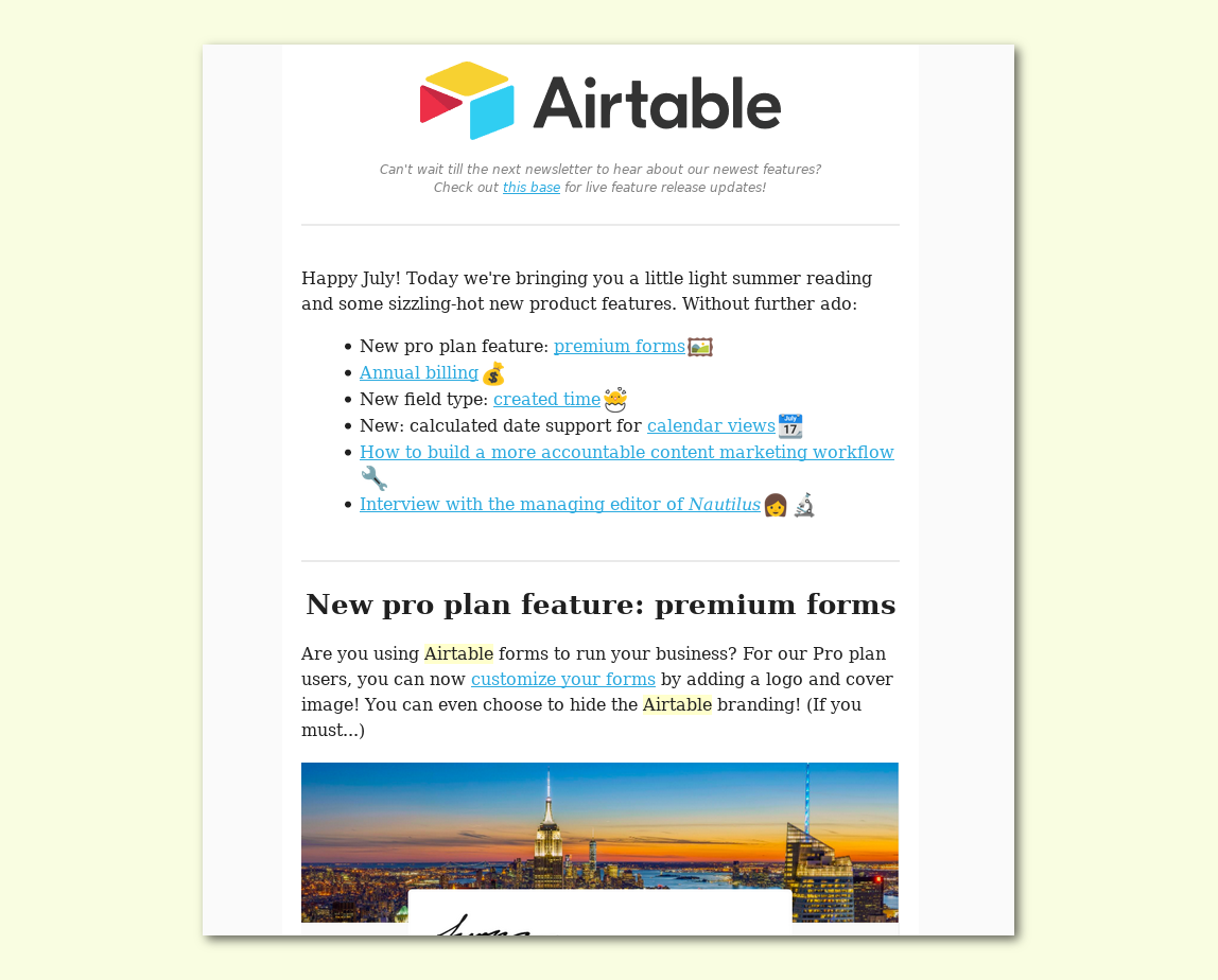
Airtable has a rapidly-expanding product, but chooses to send marketing and product updates very rarely.
Instead of bombarding every user with ever feature, Airtable periodically puts out an eye-catching changelog newsletter. This suits their product well because they make many small useful tweaks at the request of their vocal user base in each release cycle.
Inside the email, Airtable bullet-points the features and highlights with emoji, making the email friendly and scannable. Even without reading further or clicking through, a skim-reading user still gets the essentials.
EXAMPLE #2: Wistia
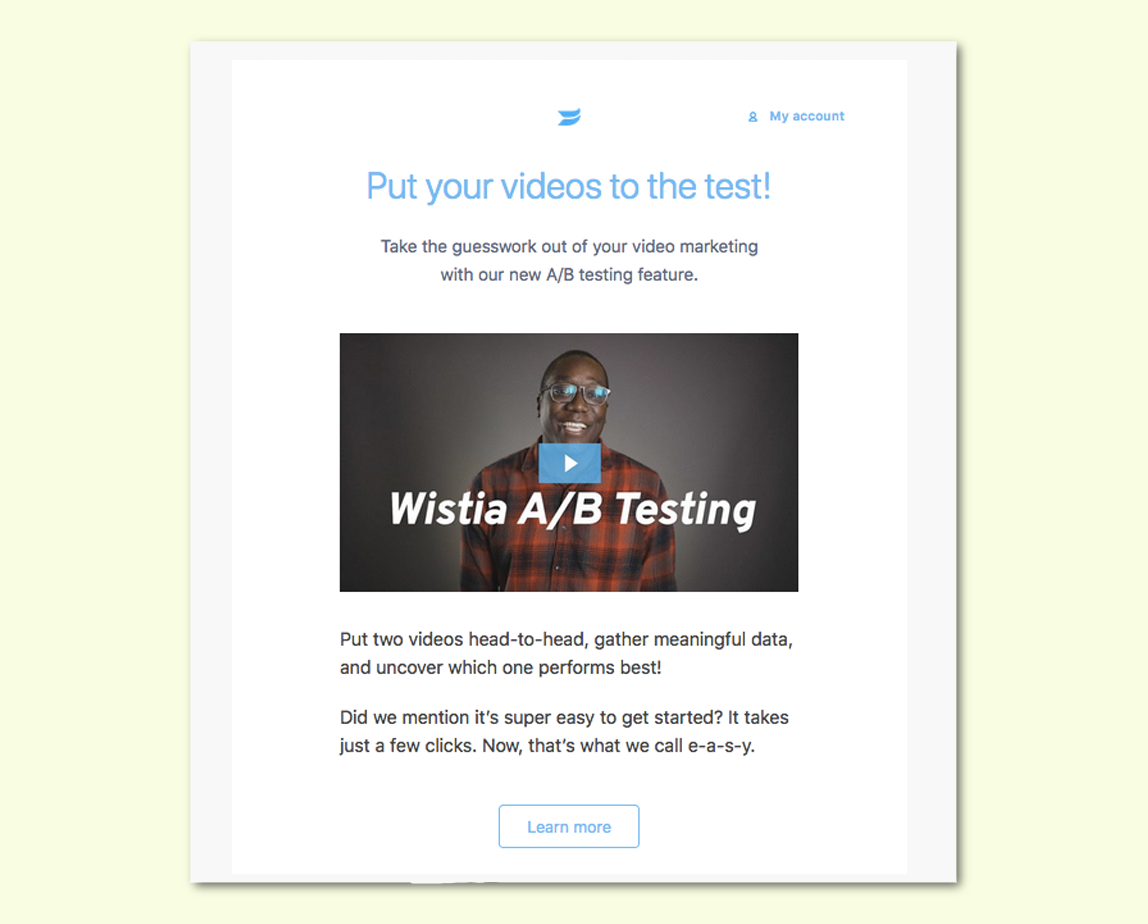
Since it’s focused on one feature, Wistia’s feature announcement email is more geared towards getting the user to test the feature out right now. It follows the simple formula; communicate the benefits, describe how it works, and then prompt a next action. And, staying true to their product, Wistia delivers the news with a 40-second announcement video that shows off footage from the feature.
A/B testing is a big platform upgrade, not a minor tweak or UI overhaul. By broadcasting it over email with short, action-oriented copy, Wistia has the chance to re-engage churned users who were dissatisfied with the product or evaluating other (A/B testing-enabled!) services.
Email feature announcement best practices
- Be mindful of noise. Use email sparingly and with purpose, or your important future messages could be met with the inbox equivalent of banner blindness.
- Send emails for features that could re-engage disinterested users. Email isn’t sexy, but it’s reliably delivered — make flagging users pay attention when an in-app message would be too little too late.
- Collect smaller features into a changelog newsletter. This allows you to send every feature to every user without being spammy. This caters for users who are following your product’s development excitedly but don’t use it regularly.
- Explain the feature without asking for a click. Email open rates in the SaaS industry are around 20% and clickthroughs are 2%. That means 10 times as many people will read the email, than will click through to the feature announcement blog post or demo; don’t waste words.
Add a UX feature announcement for your next launch

The reason in-app feature announcements improve product adoption is simple: you’re more likely to get a user to engage with a feature if it’s discoverable, easy to try, and can demonstrate clear value.
Using the best practices and framework in this post, you can wow new users and re-engage disinterested ones with feature announcements that make your product stick.
Join our Slack community to network with like-minded developer marketers like yourself!
